Let’s start with the ‘best.’
The District of Columbia has the highest percentage of their population fully vaccinated, at 74.8%.
Next is Rhode Island with 73% and then Vermont at 71%.
Now, some states are larger than others. That’s why California currently has the most people fully vaccinated, with 23.5 million (D.C. has nearly 414,000 fully vaccinated).
Texas is the next state with the most vaccinated individuals, with 14 million, followed by New York and Florida, with 12 million each.
What about the ‘worst’ states?
Wyoming has the lowest percentage of their population fully vaccinated, at 40%, followed by Alabama at 42% and then Mississippi at 43%. Other ‘low-level’ offenders include North Dakota, Louisiana, Idaho, Arkansa, Georgia, and West Virginia. The latter is at 45%.
Wyoming is also the state with the fewest number of people fully vaccinated, at 236,000. Next is North Dakota at 334,000 and then Alaska with 370,000.
Now let’s compare the graphs of current covid cases and deaths between the ‘best’ and the ‘worst’ states.
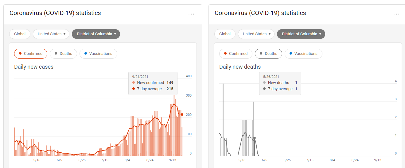
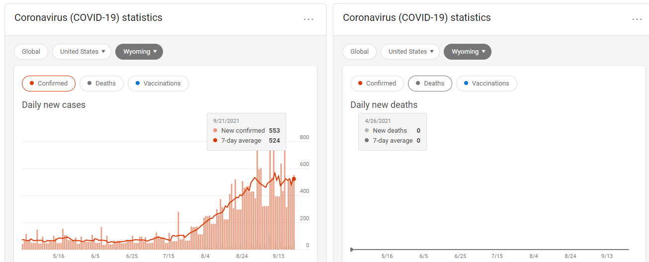
Here’s D.C. compared with Wyoming, the ‘best’ vs. the ‘worst.’
This is pretty interesting. Despite D.C. being the best for taking the vaccine, and despite Wyoming being the worst...both states have the exact same curve of infection at the moment.
Sure, Wyoming is seeing more daily cases (553 vs. 149 on Tuesday), but I have a feeling Wyoming will see that come down soon, while D.C. will have their rate remain constant.
The death graph is also interesting. Despite D.C. being the best in the country for the jab, they’ve counted 23 deaths since the end of May. In Wyoming, they haven’t had a death from covid in over 5 months.
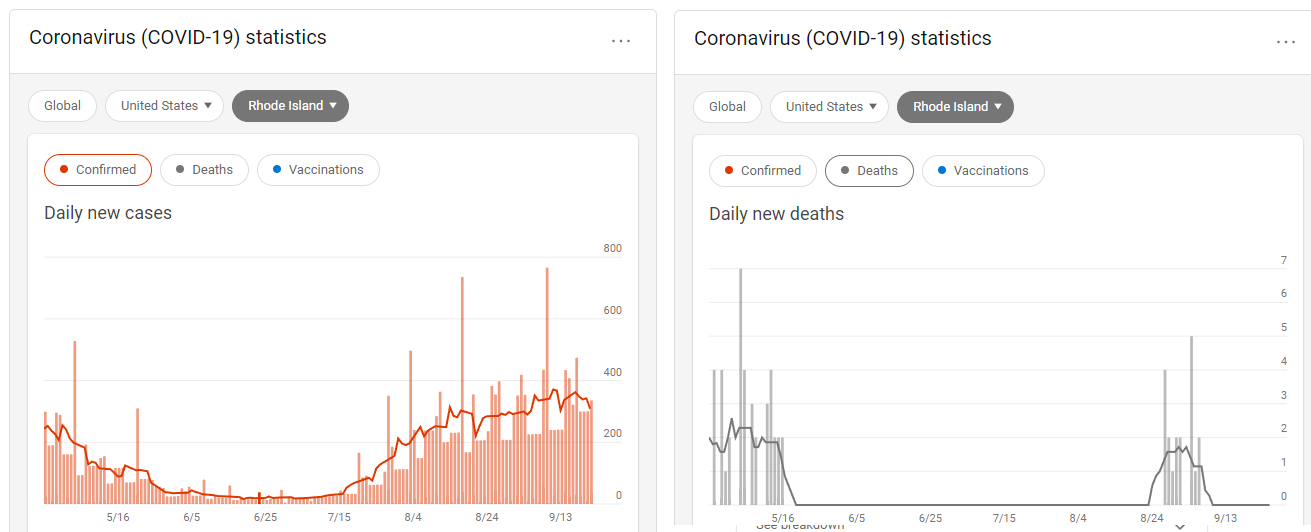
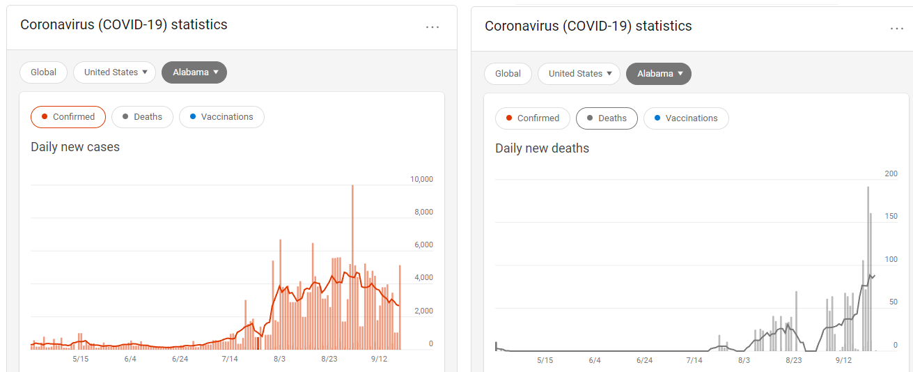
Now let’s compare the second ‘best’ and second ‘worst,’ these being Rhode Island and Alabama, respectively.
Again, both graphs of daily cases are about the same...though Alabama has been trending down all month while Rhode Island has remained fairly constant. The case counts are wildly different, though, with Rhode Island having 336 new cases on Tuesday compared to the over 5,000 Alabama reported the day before.
Alabama is also dying a lot more than Rhode Island is. Alabama had 161 new deaths on Friday, while Rhode Island had zero. In fact, Rhode Island has been having relatively few deaths for months. Alabama was the same, but then began to skyrocket starting in August.
I think a lot of that has to do with the BMI of people in the two states, their eating habits, and how much they exercise. Alabama was one of the most unhealthy states in the country before the pandemic started.
In conclusion, I think we’re seeing exactly what we saw going into last fall, the traditional cold and flu season.
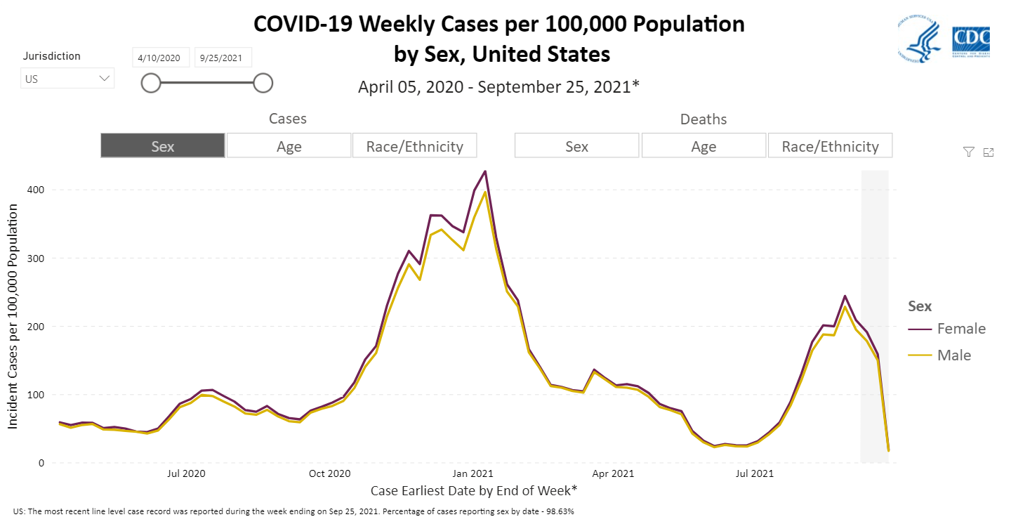
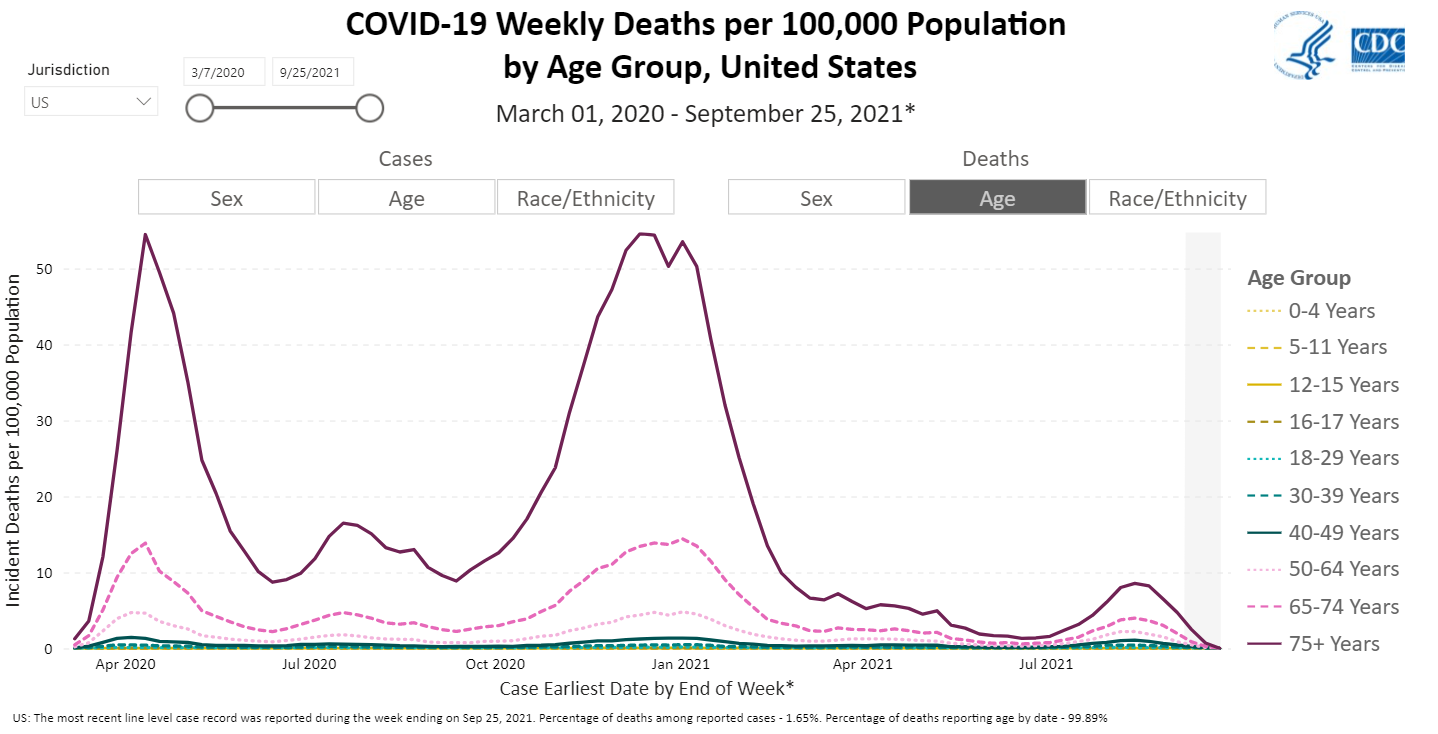
Here are some graphs to show what that looks like:
As you can see, after the initial pandemic shock from early-2020, we had the larger winter outbreak, which began to really see an uptick start in mid-September 2020.
By early January that had peaked. That particular outbreak fell to its lowest point by early-March.
There was a slight uptick in cases around spring break, but not deaths, and then both continued to fall until July, when we saw a summer bump in cases and deaths.
That fell-off again slightly before rising. It’s still rising. And we’re currently at a case point where we were last November.
That tells me this outbreak will have a flatter curve and won’t last as long. I suspect we’ll get done with this one well before Thanksgiving, perhaps even around Halloween.
Maybe it’s the vaccines that are causing this less-serious outbreak, though I believe they were the cause of the summer uptick we saw.
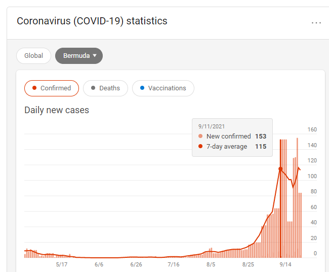
Bermuda is a fine example of this. That country didn’t impose mask mandates or lockdowns until December 2020. They hadn’t seen a covid case in months, but then they began to see an uptick after they put those rules in place.
Currently they have a 63% vaccination rate, though their covid cases have jumped by 5,600% this month alone (they haven’t had a death all year).
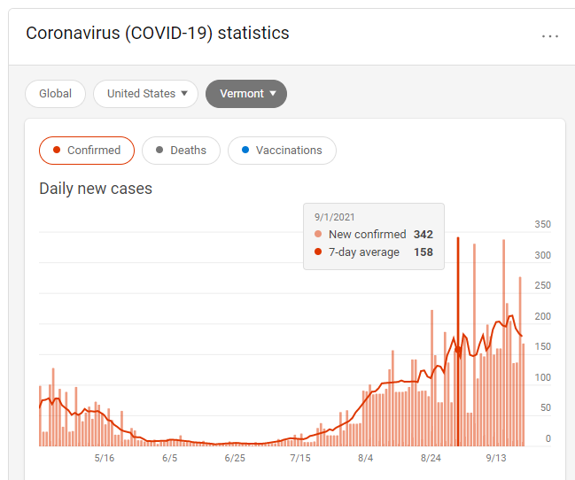
Sadly, Vermont is seeing the exact same trend.
I can’t wait to see which of these ‘best’ and ‘worst’ states will get over the current outbreak the soonest, and with the least damage.
It’ll be interesting to see how the corporate media spins it.
After all, why are states with some of the highest vaccination rates seeing such a huge uptick in cases?
Why do states with some of the lowest vaccination rates mirror the exact same trend?
Why are the graphs so similar?

