

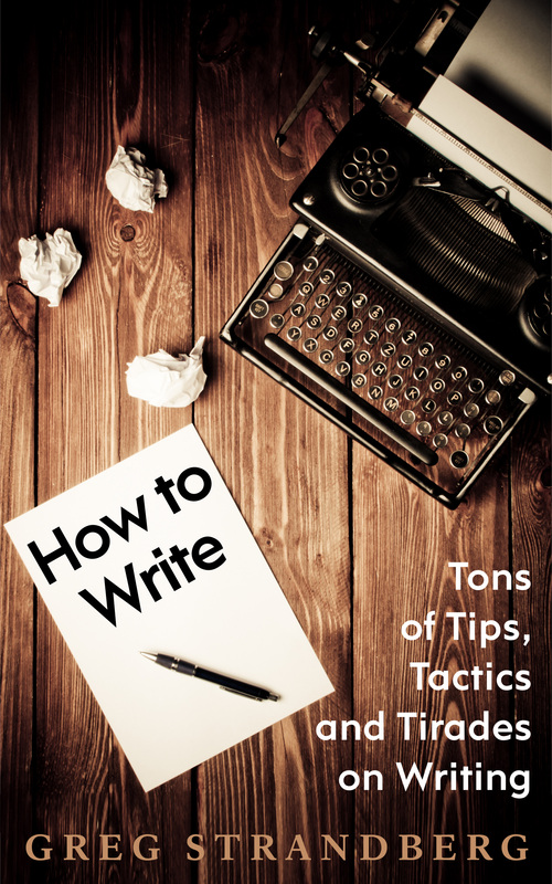
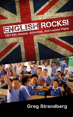
I’ve been working with Johnny Atomic of Atomic Covers on a new eBook cover for The Hirelings. Today I want to tell you a bit about what that process is like, and how great eBook covers are made.
First of all, I didn’t send a chapter from my book or detail a scene I wanted. Well, I did…but then I was told this wasn’t how the best cover was going to come about. Instead, we chatted on Skype for a bit, and Johnny was able to get a feel and idea for what I was going for.
Take a look at these early drafts that came about because of that, with commentary on what they are from Johnny himself:
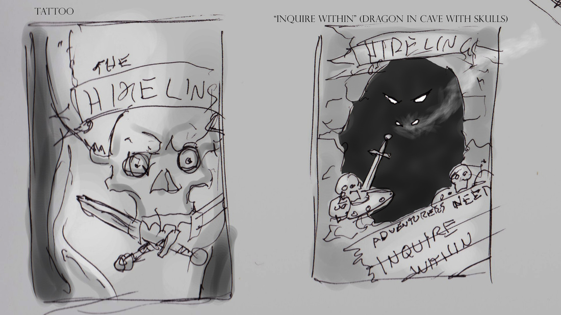
Tattoo and Dragon's Cave
Tattoo: A burley warrior's arm displays a detailed logo of the Hirelings "brand". This would be painted in a near-realistic style. Again, this speaks to the toughness of the group.
Evokes a "biker gang" feel which is less military and more "homegrown" while calling back to the iconoclastic behaviors associated with gangs.
Dragon’s Cave: Classic Frazzetta style dragon’s cave with glowing eyes, nostrils and smoke coming out. Skulls and skeletons, shields and swords are all piled up outside the cave in another classic D&D type image. The sign in the extreme foreground reads "Adventurers wanted, inquire within".
This image evokes the nostalgic feelings of fun and trepidation associated with the classic D&D boxed scenarios. The foreground sign brings in the concept of commerce being an underlying theme.
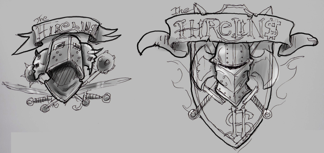
Two Icon/Logo looks
The left image suggests a super-detailed illustration much like the Expendables logo. The second one is more of a "fully painted" image done in strong realism. Either way, with this idea that the logo "is" the cover.
This image type would say "This is an elite team of super badasses" and have the obvious tongue in cheek connection with The Expendables.
(Note to readers: The movie “The Expendables” was the cover image I was originally going for on this when I put the book out).
This image type would say "This is an elite team of super badasses" and have the obvious tongue in cheek connection with The Expendables.
(Note to readers: The movie “The Expendables” was the cover image I was originally going for on this when I put the book out).
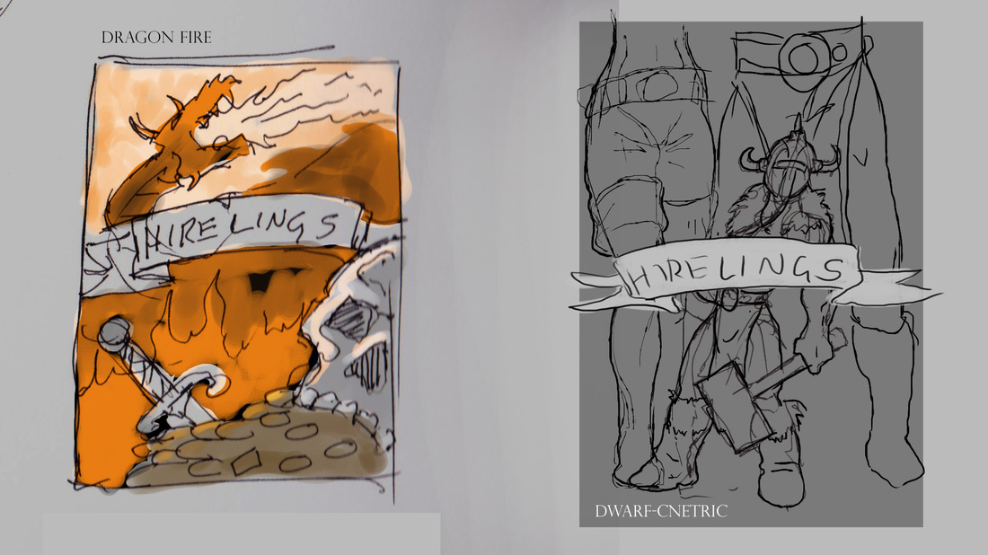
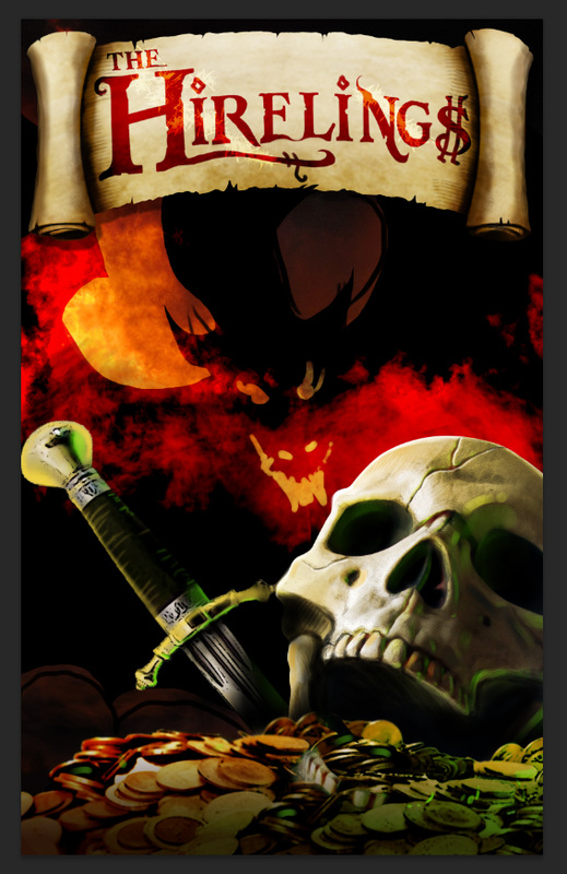
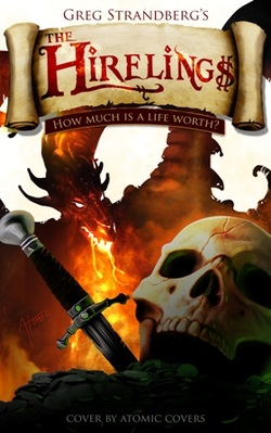
Dragon's Fire and Dwarf-centric
Dragon’s Fire: A grim skull floats on a sea of gold and jewels no one will ever claim. In the background a giant dragon is in partial silhouette against a conflagration of its own creation.
This one is dark and in your face. Only the very boldest could survive what we are seeing. It speaks to the intense bravery of the team, the hellish power of the dragon they must eventually face and the thirst for gold that drives the desperate.
Dwarf-centric: This is more like your first cover but with the humorous twist that while the whole team is at least partially visible the story is clearly about the dwarf who got the band back together.
This speaks to the camaraderie of teams like this one and the forcefulness of the dwarf's personality.
Those are all great cover ideas, and I got them all at once from Johnny. I kicked them around, asked people on social media, but in the end went with what I felt the designer wanted to do.
Why is that?
Because I think they – and I speak about designers in general here – formed an opinion of what idea they like best, and what they think will work best for me. And when I say work best for me, I mean sell my book. Sure, I want people to get an idea of what the story is from the cover, but even more, I want them to read my book! They’re not going to do that if they don’t buy the book, and they’re not going to buy the book if the cover’s rubbish…like the current cover is.
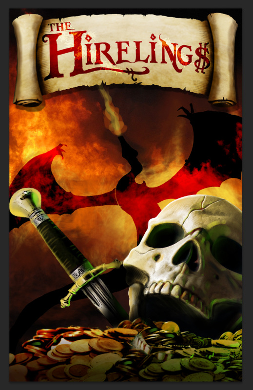
That’s why I decided to go with Dragon’s fire, and this is what the next design looked like:
Why is that?
Because I think they – and I speak about designers in general here – formed an opinion of what idea they like best, and what they think will work best for me. And when I say work best for me, I mean sell my book. Sure, I want people to get an idea of what the story is from the cover, but even more, I want them to read my book! They’re not going to do that if they don’t buy the book, and they’re not going to buy the book if the cover’s rubbish…like the current cover is.
That’s why I decided to go with Dragon’s fire, and this is what the next design looked like:
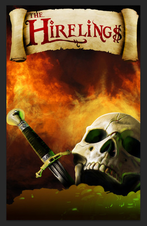
Wow, that’s looking pretty dang good, huh? That’s better than many covers you see out there, and we’re not even done yet!
Oh, and did you forget that we have a dragon? Here are what two more drafts look like:
Oh, and did you forget that we have a dragon? Here are what two more drafts look like:
 |  |
Pretty cool, huh? I’m really feeling good about this book now, and I’m getting exited too.
Can you imagine what a little marketing behind this might do? People might finally buy it!
That’s as far as we’ve gone, and I’m going with the “in your face” design you see there on the left. The final cover should be done soon, and I should have this book updated on Amazon shortly. I hope you’re looking forward to the new cover as much as I am. Thanks for reading…and make sure you check out what Johnny Atomic at Atomic Covers can do for you.
Check out the site right now!


 RSS Feed